

*** This project was a part of my internship work. I joined this startup at its initial phase and hence, got to work at it from the idea to the actual product as I was the only designer in the organization and not to mention, the world of things I got to learn while interning, cannot thank enough!! ***
TreeVed is an early stage startup based on the vision to grow together by storing, organizing and sharing the best resources available across the Internet.
MY ROLE: Brainstorming the idea, Branding, Wireframing, Iterating the designs, Prototyping, Usability Testing.
PROJECT TIMELINE: ___________to ______________
DESIGN GOAL
"It is better to know one book intimately than a hundred superficially." ~Donna Tartt, The Secret History
With technological advancement, this is the exact problem with the links we consume. Revisiting important links is not something that everyone is used to.
So, the idea was to design 3 important features of the app:
1. Diary - To store meaningful links, we consume on a daily basis.
2. List - To categorize the meaningful links from Diary.
3. Feed page - To share those meaningful links with others.


LOW-FIDELITY WIREFRAMES
After lots of brainstorming sessions, low-fidelity wireframes were created with the help of Figma tool.


BRANDING
The TreeVed brand was made where certain colors were chosen and everyone in the organization was invited to vote for the color that best represents the company's ethics and values. Finally, this came to a conclusion.


HIGH-FIDELITY WIREFRAMES
Although a lot of, was to be dealt with, regarding all the features of the app, we experimented on how high-fidelity wireframes would look like. Everything at the startup was moving at a very fast pace, so, without wasting a second, we needed to jump on high-fidelity wireframes.
Feed Page
In feed page, one can share the meaningful links as post with one another.
In every post, we had the following options:
- average rating of the post
- recommend the resource to anyone on TreeVed
- add to list the resource for the future
- share the post via other platforms
- rate the post by the user
ITERATE! ITERATE! ITERATE!
We carried out a number of usability tests at every stage of the process. We observed the user behavior and gained a lot of user feedback regarding the positioning of the options on the post card in feed page.
-
Here, we added a slider bar for decimal rating the resource because the user feedback revolved around having very less number of options to rate and the majority rating observed was either 4* or 5*.
-
We added 2 widely used and important buttons:
-
Completed - for already having completed (consumed) the resource.
-
Save for future - for saving the resource for future (later) use.
near every resource in the post card for the user to easily access them.
-
We also made it easy for the user to post on TreeVed by having a call to action button to post at the top of the screen.
Share button in kebab menu
-
A lot of options in the post card were confusing to a new user, so, we tried reducing the number of options by:
- moving the Share button from the post card to the kebab menu (three vertical dots).
- adding the rating slider bar in place of it.
-
Save for future button was changed to a ghost button as both the buttons were together attracting a lot of attention and none was giving justice to it, as per the observed user behavior.
-
The post call-to-action menu was taking a lot of space on the screen, so, it was reduced to its compact size.
-
The post content screen was also simplified to make it look clean and less intimidating for the users.
-
The light grey color used was removed everywhere in the background to give it a more modern and minimalistic look.
-
The recommended button has also been extensively tested and iterated in order to have our final screen.
-
The search bar at the top was also removed to move it into the search page for better convenience.
Diary - the second most important feature of TreeVed.
Using diary, one can store the meaningful links, one come across on a daily basis.
Your diary entries get stored in your profile page and are completely private to you.
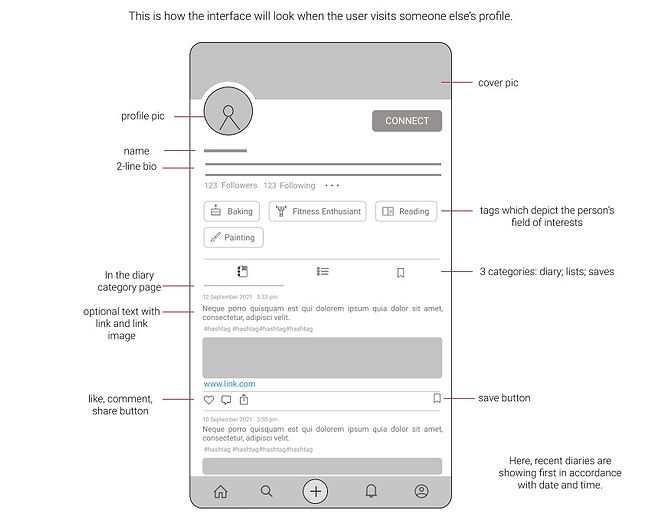
Details of the user:
cover pic, profile pic, name, bio, followers/followings.
These interest tags help people to follow one another according to their mutual interest.
4 tabs: diary; list; activity; about
Add a new diary entry button
A calendar to help find the diary entry of a particular day
A filter button to sort the diary entries
Profile Page
The profile page also went through several iterations and testing, the results are shown below:
TreeVed is an early stage startup based on the vision to grow together by storing, organizing and sharing the best resources available across the Internet.
MY ROLE: Brainstorming the idea, Branding, Wireframing, Iterating the designs, Prototyping, Usability Testing.
PROJECT TIMELINE: September 2021 to March 2022
DESIGN GOAL
"It is better to know one book intimately than a hundred superficially." ~Donna Tartt, The Secret History
So, not boiling the ocean rule, i.e., we cannot read every resource on the Internet.
Learn more from consuming less. With technological advancement, this is the exact problem with the links we consume. Revisiting important links is not something that everyone is used to.

Internet is an ocean of information,
only a bucket is useful.

We become the food we eat and the data we consume.
Everyday we visit 100s of links across the Internet,
few of them we wish to store for future and
few are amazing enough to share with everyone.
Discover & Store amazing resources across Internet
It's free but scattered.
Let's collect the bucket from the ocean!
So, the idea was to design 3 important features of the App:
1. Diary - To store meaningful links, we consume on a daily basis.
2. List - To categorize the meaningful links from Diary.
3. Feed page - To share those meaningful links with others.
BRAINSTORMING IDEAS
A number of brainstorming sessions were conducted with the founding team to get an in-depth knowledge and use of each of the three features - diary, list and feed page.
Crazy 8's design sprint method was also used to generate more and more ideas.
LOW-FIDELITY WIREFRAMES
After a number of brainstorming sessions, low-fidelity wireframes were created with the help of Figma tool.
BRANDING
The TreeVed brand was made where certain colors were chosen and everyone in the organization was invited to vote for the color that best represents the company's ethics and values. The following was finally finalized.
HIGH-FIDELITY WIREFRAMES
Although a lot was to be dealt with, regarding all the features of the app, extensive experimentation was done on how high-fidelity wireframes would look like. Everything at the startup was moving at a very fast pace, so, without wasting much time, we jumped on to high-fidelity wireframes.
Feed Page
In feed page, users can share the meaningful links as post with one another.
In every post, the following options were made available:
- average rating of the post
- recommend the resource to anyone on TreeVed
- add to list the resource for the future
- share the post via other platforms
- user rating of the post
ITERATE! ITERATE! ITERATE!
A number of usability tests were carried out at every stage of the process. The user behavior was observed and user feedback was gained regarding the positioning of the options on the post card in feed page.
-
A slider bar was added for decimal rating the resource because the user feedback revolved around having very less number of options to rate and the majority rating observed was either 4* or 5*.
-
Two widely used and important buttons were added:
1. Completed - for already having completed (consumed) the resource.
2. Save for future - for saving the resource for future (later) use.
near every resource in the post card for the user to easily access them.
-
It was also made easy for the user to post on TreeVed by introducing a call to action button at the top of the screen.
_______________________________________________________________________________________
Process to rate a resource
Share button in kebab menu
-
A lot of options in the post card seemed confusing to a new user, so, the number of options were reduced by:
- moving the Share button from the post card to the kebab menu (three vertical dots).
- adding the rating slider bar in place of it.
-
Save for future button was changed to a ghost button as both the buttons were together attracting a lot of attention and none was giving justice to it, as per the observed user behavior.
-
The post call-to-action menu was taking a lot of space on the screen, so, it was reduced to its compact size.
-
The post content screen was also simplified to make it look clean and less intimidating for the users.
-
The light grey color used was removed from the background to give it a more modern and minimalistic look.
Recommend Feature
With this, one can recommend movies, books, articles or any resource to your colleagues, classmates Or friends.
-
The recommended button has also been extensively tested and iterated in order to have our final screen.
-
The search bar at the top was also removed to move it into the search page for better convenience.
Diary - the second most important feature of TreeVed.
Details of the user:
cover pic, profile pic, name, bio, followers/followings.
These interest tags help people to follow one another according to their mutual interest.
4 tabs: diary; list; activity; about
Add a new diary entry button
A calendar to help find the diary entry of a particular day
A filter button to sort the diary entries
A diary entry with options to:
- Rate a diary entry
- Recommend a diary entry
- Add a diary entry in the list (for categorizing)
- Share a diary entry
Profile Page
Using diary, one can store the meaningful links, one come across on a daily basis.
The user's diary entries get stored in the profile page and are completely private to the user.
The profile page also went through several iterations and testing, the results are shown below:
-
At first, a fixed name available was allotted to the user. Later, through testing, the problem was identified and the importance of having a unique username next to the display name of the user was realized.
-
Diary and lists were the two major features on the profile page, but the colorful interests tabs caught the user's eyes more than the diary and list features. So, the colors were removed at first.
But in the next iteration, the common interest tabs were given a light tone of brand color to highlight the mutual interests in the other users' screen.
-
A profile completion bar was added to direct the new users to the first right steps in using the application.
-
One-on-one interviews helped in knowing the user's needs. So, 4 tabs, which were diary; list; activity; about were finally reduced to 3 tabs: diary; list; posts. Some users felt that activity tab violated their privacy of using the application.
-
Grey background color was removed to give the interface a cleaner look.
-
A number was also indicated next to the tabs to indicate total number of diary entries and lists in a user's profile.
Lists - the third most important feature of TreeVed.
Using lists, the users can categorize the meaningful links (resources) from the diary.
The lists get stored in the profile page and helps it easy to find and access resources.
List: Fiction
List: Public Speaking
Lists in profile page
Full page list view
One can name the list according to the collection of resources in the list; as shown above.This, again, went through several tests and iterations and the results were:
Lists on user's profile page
There are two default lists on the profile page:
1. Completed: Contains all the resources which you have already completed (consumed).
2. Save for future: Contains the resources which you have saved for the future (later use).
A button to create a new list
When user visit's someone else profile
Common interest tags are highlighted; we can follow people with mutual and similar interests with ours.
One can edit, bookmark, recommend, share and add as many resources they want, in a list. Lists make it easier to find and access resources whenever one needs.
Users can view, share, recommend and bookmark lists made by other people and discover the best resources on the Internet.
Is that not incredible?
If Eisha wants to learn design, she can follow some amazing designers on TreeVed and learn from the best of resources for free, instead of browsing all over the Internet.
This can definitely save Eisha a lot of time and energy to learn a skill which is already learnt by many; but she has to repeat the whole process of finding the right resources in order to learn the skill.
The BEST is scattered across the Internet. We all know of such links or content which should be shared with everyone. While helping each other grow, collectively we are also collecting the useful bucket from the ocean of information.
-
The users can view the list resources in full page view as well.
-
The users can also rate the resource if they've already completed it; add a note related to the resource, share via other platforms and recommend a single resource or the whole list containing several resources to their friends, peers and family members.
-
The list feature is very handy and can keep our resources safe and organized.
THE NEW CHALLENGES
After numerous tests with users via telephone calls, direct interviews and feedback, the following issues emerged:
-
For those aged 35 to 45 years with reduced vision, the brand color was less visible.
-
It was difficult for some users to understand working of features in the app like diary, lists and recommend option.
-
The users felt quite a task to copy and paste the link of the resource on TreeVed app.
-
Some users also wanted the application in dark mode.
TEST!
TEST! TEST!
REVALUATION OF DECISIONS
Following long hours of meetings which continued over days with the founding members and other members of the organisation, the decisions were revaluated and some new decisions were also taken to give the users the best experience in the application.
-
The entire application was changed to a different color, which was finalized as the new brand color. Since the application was all about storing meaningful links, the new brand color represented the color of links. This color scored better on visibility than the previous color solving the pain point and increased the overall accessibility in the application.

-
For the features: diary, list, recommend; to be better understood by the users, a lot of brainstorming was done with the onboarding experience of the app.
Testing revealed that users were using TreeVed more like other social media platforms and were using only the post option in the app to share the resources. Diary and lists were used to the least. The vision for the application was not adequately communicated to users.
So, it was decided to design the onboarding experience in a way that it, not only makes the users understand the vision of TreeVed but also lead the users in the right direction to use the app.
-
For making it easy for the users to store and organize their links on TreeVed, a chrome-extension for TreeVed was also designed.


-
Dark mode of the application was also designed and implemented so as to meet every group of users needs and give the best user experience in the app.
THE FINAL SCREENS
%201%20(1).png)
Thank you for your interest in my work. Let's connect!